Design Inspiration: 8 Wine Bottle Designs That Get Better With Age

Go to the wine aisle in any grocery store, and you start to see a big problem. So big, you can’t ignore it — too many choices! The average grocery store has dozens or hundreds of kinds of wine, to say nothing of the thousands of options when ordering online. Even if you limit your choices to a specific type of grape, you’re still left with dozens of brands.
As a winery owner, you can look at a wine label and get a good idea of what’s in the bottle. But for the average consumer, it’s a different story. So, how can you make choosing a delectable wine easier for them? With a brilliantly designed wine bottle label.

But you’ve still got the other problem — shelves crammed with wines from dozens, even hundreds of competitors. How can you design a wine bottle that stands out against brands with household names?
Hear that whoosh? It’s not a plummeting weather balloon; it’s your incoming design inspiration! We’ve put together some key takeaways from our favorite wine bottle labels and packaging designs that will only improve with age.
What are the Most Important Elements in Wine Bottle Design?
Investing in an eye-catching wine bottle design, label, and packaging is critical. An eye-catching label will grab consumers' attention and differentiate your product from your competitors.
But wait, there’s more! The label and packaging also tell your brand story and values. It creates a memorable experience for the consumer, and increases the perceived value of the wine.
Hold up. We’re not done yet. It can also make the bottle more attractive as a gift or souvenir, which opens up other use cases and additional avenues for marketing and selling to different target audiences.
In short, a great wine deserves a great package, and a great package can make a wine even better — for both your business and your customers.
8 Lessons from Our Favorite Wine Bottle Labels
Pour yourself a glass of vino, and let's uncork some serious creativity. We've scoured the vineyards far and wide to bring you the top wine bottle labels and packaging designs that are as bold, bright, and beautiful as the wines themselves. So grab your corkscrew and let's pop the top in some serious style.

1. Interactive innovation for the digital age
The wine market is crowded. To stand out, you need an innovative, creative design that speaks to modern consumers. One source of inspiration comes from 19 Crimes and their augmented reality labels.
With a quick scan of the label via your smartphone, you'll be transported back to the 19th century to hear a convicted criminal spill the tea on how they ended up in Australia. Talk about an immersive and engaging experience! And if that wasn't cool enough, the label is using some next-level tech that will make you feel like you're living in the future. In other words, don’t be afraid to innovate and create something unique and interactive.

2. Tell it like it is
We love the design because it tells it like it is. It reaches out to a target customer base that isn’t really looking for an elegant, celebratory wine (although there’s nothing wrong with pinky-out fanciness). This wine is more so for people who need a little pick me up.
It’s blunt but effective. Sometimes that’s all you need to get your point across. This bottle doesn’t have any cursive illustrations of vineyards; this design is more akin to a barrel around a Saint Bernard’s neck. Use this wine bottle design to inspire your own if you’re targeting a similar audience and use case.

3. In vino veritas
In vino veritas is Latin for there’s truth in wine. Alcohol has an uncanny ability to untie tongues and reduce inhibitions. Whether that’s a good or a bad thing, your mileage may vary. But regardless, you should lean into it if it’s on-brand for your winery.
Take a page out of the smart-alecky book from the wine bottle design B Frank. The proof is in the name. They’ve printed their label on a matte white surface and left lines so you can fill in your own reasoning. It makes a perfect gift for an unusual occasion and is another great example of creating an interactive experience through your wine bottle label.

4. Dichromatic drama
If your brand’s a bit of a drama llama, get inspired with this dichromatic feast for the wine-soaked eyes. Although black and white is often used for more minimalist designs, this one takes it up a notch into a more striking, theatrical performance.
Why does typically plain black and white work for wine bottle designs? Because wine bottles are usually either dark glass with a dark label or clear glass with a colorful label. BiancoNero, true to its name, is white with black splotches. It stands out, and that’s what makes it unique.

5. Helpful Hermitage Hints
Wine is the perfect adult beverage for bringing out the subtler herb and spice flavors in a meal. But the trick is, you’ve got to pair it right.
Do your customers a solid and make pairings easier for them. This wine bottle design from The Tapas Collection has easy-to-understand chalkboard-style pairing notes. Wine is intimidating to the average enjoyer, so offer ways to heighten their tasting experience.

6. Appeal to the scholastic sommelier
One wine-drinker stereotype is that they have discerning tastes, value education, and are a bit bookish. If that’s the type of customer you’re targeting, why not run with it?
Take a look at this awesomely academic wine bottle label and package from Pat Merhabi and Australia’s Red Head Studios. It’s not really a label at all, but instead comes with a tag and package insert inspired by Grey’s Anatomy drawings. The old-timey wax seal and blood-red wine inside make this as much a collector’s item as an entertaining drink.

7. Jewel tones and ergonomic forms
These eye-catching, beautiful colors are one thing. But the shape is an out-of-this-world design choice. If you’re looking for something that really stands out on the shelves, bright, saturated colors paired with a unique shape are a winning formula.
This wine bottle design is also ergonomic. It measures the perfect pour for a standard wine glass. And it’s for people who aren’t fixing to drink the entire bottle in one go. Or it's perfect for sharing amongst an intimate group.

8. Bold Comfort and Great Value
If your brand and price point are meant for casual settings, your label should match. That’s the idea behind House Wine.
We like this label design because it does an excellent job of conveying its value to more budget-conscious shoppers who like to unwind with a glass or two after a rough day. The bold red chunky lines and graphic is homey and comforting as well.
Level Up Your Wine Bottles with Custom Labels
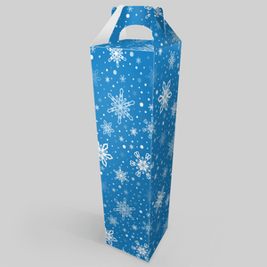
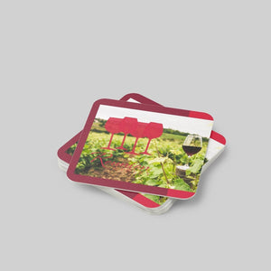
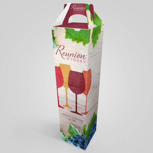
Feeling inspired to take your wine to the next level? If so, Stomp is here to help. No matter your design, our nifty design tool makes creating your custom wine bottle label as easy as 1-2-3. Once your design is in, you’ll receive a darn near instant proof. And if you really want to make a statement, don’t forget to check out our custom wine gift boxes!
- Nashira Edmiston