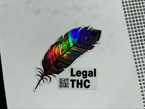
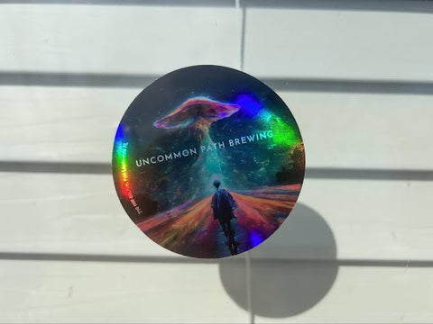
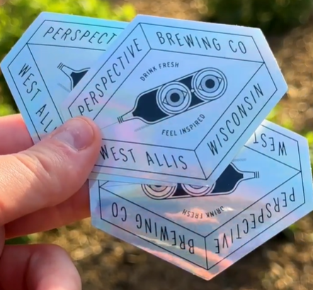
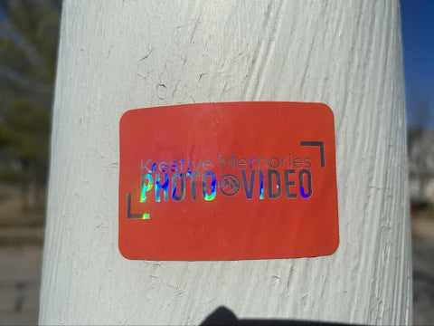
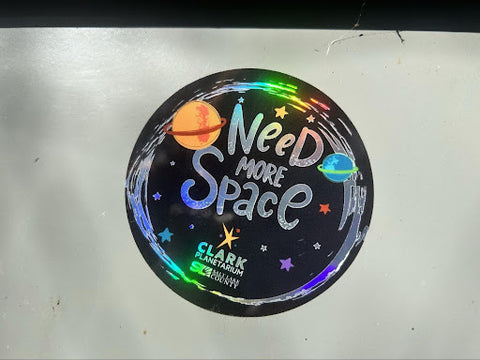
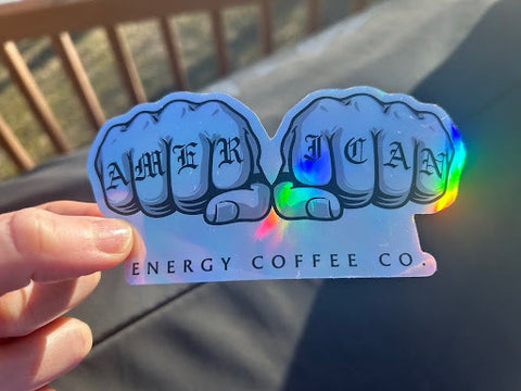
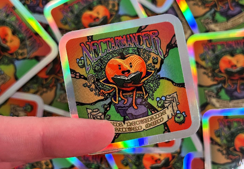
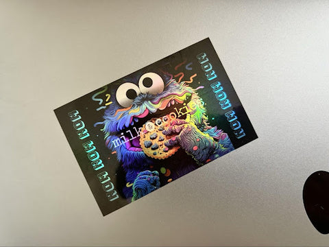
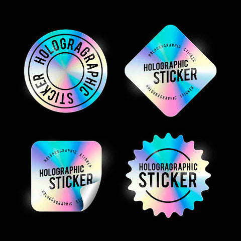
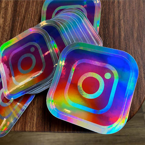
What are Holographic Stickers?
Holographic stickers use colorful, reflective material to display flashy designs. Printed on iridescent vinyl, these stickers catch every color of the light spectrum, so as you move them around, they morph and shine in a display of colors as vibrant as your brand's personality.
Whether they’re shining under soft lamplight in a boutique or in the fluorescent glare of a supermarket, holographic stickers maintain their mesmerizing appeal, making them a versatile choice for any branding strategy.

What is an Example of a Holographic Sticker?
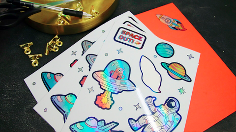
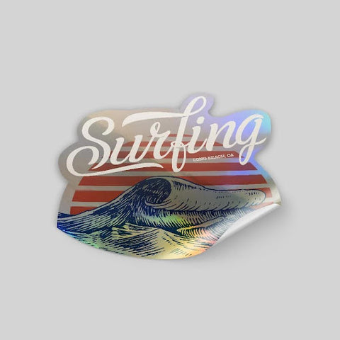
Imagine a row of products on a shelf and one is packaged with a vibrant holographic sticker that features the brand's logo. As it catches the light, the logo dances in a kaleidoscope of colors, instantly captivating the consumer's attention. This kaleidoscope creates an interactive visual experience that elevates the product from ordinary to extraordinary.
By embracing holographic stickers, brands can transform their offerings into dynamic artworks that not only stand out but create memorable unboxing experiences. For example, imagine a cosmetic brand that includes holographic stickers with its products. As the customer unwraps their gift, each product shimmers with an otherworldly glow that hints at the luxury within.
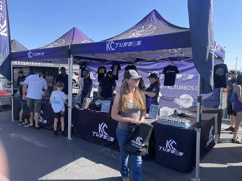
If you need some design inspiration, don’t forget to check out some of our favorite holographic stickers from customers like you!
What are the Design Benefits of Using Holographic Stickers?
The benefits of choosing holographic stickers are clear.
They provide a dynamic and engaging visual experience that can make your products and packaging stand out wherever you display them. The reflective surface catches the eye, adding depth and movement to your design. Whether it’s for a limited edition release, a special event, or everyday branding, holographic stickers can provide that extra pop to capture attention and leave a lasting impression.
5 Tips for Designing a Holographic Sticker
Diving into the world of holographic stickers opens up a realm of design possibilities that can elevate your brand and captivate your audience. The allure of these stickers lies not just in their eye-catching sheen but in their ability to highlight the best qualities of your brand.
Let’s learn some essential tips for designing holographic stickers that pack a punch.
Understand the Basics of Sticker Design
Before you dive into the nuances of holographic artistry, it’s important to nail the basics of sticker design. First, embrace simplicity and boldness. Start with a clear, straightforward approach, choosing designs that convey your message effortlessly and are easily digestible at a glance. Bold, impactful fonts and vivid images ensure your stickers make a strong visual impact.
Identify a Key Theme or Branding Style
Identifying a key theme or branding style is essential in creating a holographic sticker that truly represents your brand. This process involves diving deep into your brand's identity — its values, personality, and the message you want to convey. Is your brand playful and whimsical, or more sleek and professional? The theme you choose should resonate with your target audience, helping your sticker forge an instant connection between your brand and its fans.
Once you've honed in on your brand's essence, it's crucial to translate this into a visual rhythm that can be consistently echoed across your holographic designs. This might involve selecting specific colors that align with your brand's personality, choosing imagery that reflects your brand's values, or using typography that speaks with your brand's voice. The goal is to create a cohesive look that not only captures attention with its holographic allure but also reinforces your brand's identity.
Consider Size and Shape
When considering the size and shape of your holographic sticker, think of it as custom tailoring for your product. The perfect fit is essential. You want a sticker that complements the product or packaging without overshadowing it or getting lost in the visual mix. This means taking into account the dimensions of the surface where the sticker will be applied, ensuring the sticker is proportionate and aesthetically pleasing.
The shape of the sticker also plays a significant role in this harmony. Whether you opt for a classic rectangle, an intricate custom cut, or a shape that mirrors an element of your brand logo, it should be deliberate and reflective of your brand’s visual identity.
Adjust Colors to Compliment Holographic Design
Not every color complements a holographic sticker’s shifting shine. Choose clear, vibrant hues that pop against the luminous background. Or, opt for light tones that blend, giving the sticker’s imagery a softer look.
Leave Empty Spaces on Your Design
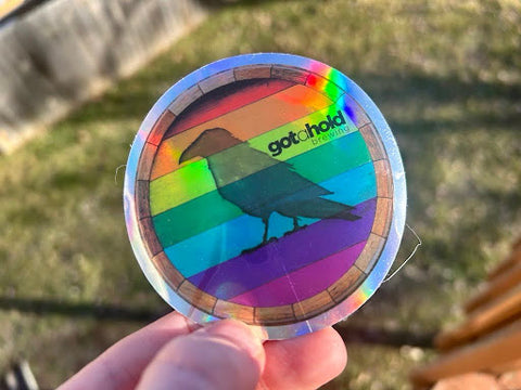
Incorporating empty spaces into your holographic sticker design isn't just about what you leave out; it's about allowing the holographic material itself to take center stage. This strategic use of negative space is akin to a visual pause, giving viewers a moment to appreciate the inherent beauty and dynamic shimmer of the holographic vinyl. It's about creating a balance where the design and the material work in harmony, allowing the holographic effects to peek through and add an extra layer of depth and intrigue.
What Colors Look Good on Holographic Stickers?
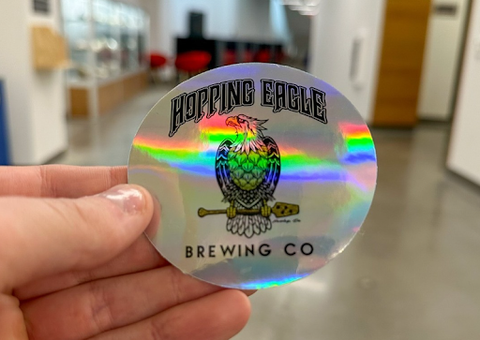
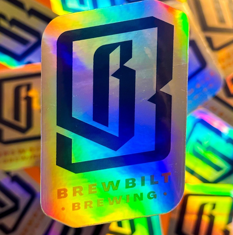
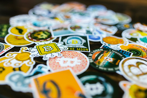
When choosing colors for holographic stickers, it's essential to consider how each hue will interact with the sticker's iridescent base. Bold, solid colors are particularly effective, offering a strong contrast against the shifting rainbow background for maximum impact. These vibrant shades ensure that your design remains front and center, catching the eye even from a distance.
Light hues bring their own unique charm, lending a soft, ethereal quality to your stickers. They blend subtly with the holographic material, creating a gentle, whimsical effect that can add a touch of magic and lightness to your design. This approach is perfect for brands aiming for a dreamy or delicate aesthetic.
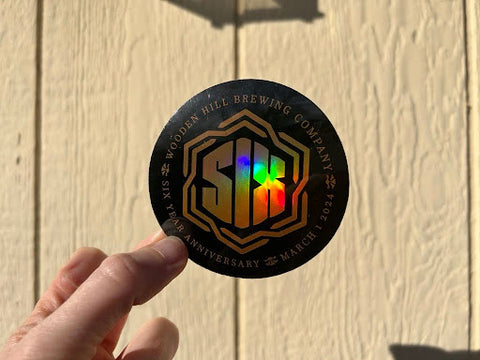
Dark tones, on the other hand, make a definitive statement. They provide a rich backdrop that allows the holographic elements to shine through in contrast, creating a striking visual effect. Dark colors anchor the design, giving it weight and presence, which can be especially powerful for conveying sophistication or boldness.
What Material is Used for Making Holographic Stickers?
Holographic stickers are crafted from vinyl film that's been meticulously embossed with patterns that diffract light into a spectrum of colors. This creates that signature rainbow effect as the sticker is viewed from different angles. This embossing process is quite precise, ensuring that each sticker not only shines brightly but does so in a way that's consistently stunning across all copies.
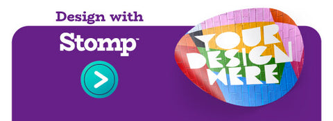
Create Your Own Holographic Sticker with Stomp
Now that you're in the holographic groove, it's time to partner with Stomp Stickers for your brand's introduction to the world of shine. Your exploration of holographic stickers is just beginning, and the next step is to bring your custom designs to life. This is where your brand can truly sparkle and stand out.
Ready to make your products shine? Explore the product options from Stomp today and start designing custom holographic stickers that highlight your brand in the best light possible.