The Importance of a Well-Designed Coffee Bag

The world is full of people who love a good cup of joe. And those people drink enormous amounts of it– about 400 million cups a day, in fact. Good news for coffee roasters, distributors and coffee shop owners, right? You bet. But making a truly excellent brew and actually selling it are two completely different challenges.
How you package and present your coffee has a big effect on your brand and your sales. Too often packaging is an afterthought for roasters and sellers when really it’s as important as what you put inside. The custom label you design must be a big part of your brand-building efforts.
Let’s take a look at how to design a killer coffee bag label to make your brand stand out, and a few key things to keep in mind along the way.

How to Design Stand-Out Coffee Bag Labels
Designing your coffee bag design begins from the “grounds” up - you’ll need to choose everything from your bag size and material to label size and then the design itself. Here are those first steps, and a few things to keep in mind during your decision making process.
1. Choose Your Packaging Before Designing Your Label
Designing your label without first choosing what kind of packaging you’ll use is a cart before the horse situation. For one thing, the bag and label have to blend into each other seamlessly and for another, you have packaging concerns beyond branding that must be addressed.
You need to consider what kind of packaging works best for your product (and your budget), your customers, and even how far your coffee has to travel. Choosing the right coffee bag is imperative.
There are a wide variety of coffee bags to choose from – gusseted bags, side-fold pouches, quad-seal bags, doypacks, and flat bottom bags. Deciding which is right for you depends on:
- Size and durability. Roasters that sell right from their shop generally don’t want, or need, large, heavy-duty packaging. But those distributing across the country or around the world definitely will. How far does your coffee need to go before it makes it to your customer’s counter?
- What your customers find appealing. With packaging being an important factor in buying decisions for 72% of consumers, researching and experimenting to find out what appeals to your customers is an important step.
- Your brand. One style of coffee packaging may speak more to your vibe than another. Having a package that makes sense for your brand is just as important as any of these other considerations.
- Your budget. There are some very fancy packaging options out there. And that fanciness is reflected by the price. If your budget leans toward the more modest end of the coffee packaging spectrum, don’t fret. Your label can do some pretty heavy lifting when it comes to brand work. Don’t be afraid of budget-friendly choices.
2. Decide What Information Matters Most
Before you dive into font choices and graphic design elements, you need to decide what you want your coffee label to focus on presenting:
All about the roast
A lot of coffee consumers have become more informed about the different flavor profiles and styles of coffee available. Some prefer a fruity blonde roast, others want it bold and dark. And while simply labeling a roast light or dark could be fine, you can also take this as an opportunity to create some clean, compelling copy.
Talk up the roast, the flavors, the ideal way to brew – and enjoy – your product.
All about the bean
Really informed coffee aficionados very definitely have origin preferences. They’ll want to know if you sourced your beans from Nicaragua or if you used a Tanzanian Peaberry in your blend. But even less fanatic coffee drinkers will find that information interesting if presented in the right way. Information on how you process or blend or roast can also be worth including.
The key here is to determine what information your ideal customers will connect with, and present it to them in a way that suits your brand.
All about your brand
Ask yourself what potential customers need to know about your brand in order to decide if it’s for them. What makes your company, your product, or your process of creating your roasts unique? Maybe you’ve been in business for over fifty years, maybe you work with a single-source supplier and can vouch for your beans from plant to the coffee pot.
Whatever makes you you, put that front and center.
3. Grab Attention with Colors, Fonts & Graphics
Like any label design process, something to keep forefront in your mind every step of the way is your branding to date. Consistency is key to successful brand storytelling, so any labels you design have to blend into the wider story you’re telling. Think of your brand as a novel, and labels as their own unique chapter inside that novel, and your colors, fonts, and graphics are the main characters:
Colors
Use colors strategically to both communicate your brand’s aesthetic and the specific vibe you want for the coffee you’ve got in the bag. Is it high end and luxurious? Is it a bold, caffeine-heavy punch to the gut? Is it mellow and fruity and soft, perfect for a long slow Sunday morning?
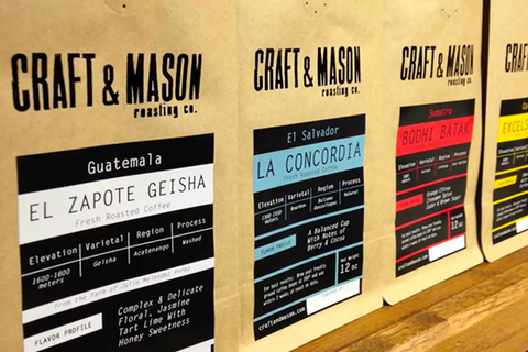
Craft & Mason, for example, went with black as a base color, then bold colors to contrast and distinguish different roasts quickly and easily, making their labels stand out loud and proud.
You’ll use every element of your label to tell this story, but starting with a color scheme will get you off on the right foot.

Fonts
Chances are you already have at least one, possibly a few, go-to fonts that your brand uses. It’s useful to think of a font as the tone of voice with which you communicate to your customers. Again, your coffee label should be an extension of all previous marketing efforts.
Rosefino, above, manages to incorporate their logo and a rather large amount of information onto their label by making use of clean fonts and careful spacing. This communicates a quiet, confident air about their brand.

Pictures and graphics
While coffee labels can be fairly large, giving you quite a bit of room to play with, you may end up with a large amount of information you want to include. Company name, roast information, any information you’re legally required to include – incorporating pictures, logos, or other graphic elements into these is a challenge. But it’s also an opportunity.
Visual elements are appealing on their own, and also break up blocks of text that might otherwise crowd your coffee label and make it unreadable or just plain unappealing.
Reverie Roasters is clearly brand-first oriented with this label, taking up over half the available space with their logo. But it’s a strong, eye-catching logo, drawing the eye, making you step closer to see what else the label has to say.
Create High Octane Coffee Labels with Stomp
Coffee is the first thing many people think of when they wake up in the morning. It’s why they take a break mid-afternoon. It’s what keeps night owls fueled for the third shift, and it’s what online daters cling to during awkward first meet-ups.
The key to selling your coffee to all those java drinkers is designing a label that appeals while it informs. Coffee bag labels are often the first-time people encounter your product. It’s a very tiny billboard advertising the roast, the brand and the company that sells it. A very tiny billboard that shoppers will use to judge whether or not they want to buy your product. And even decaf drinkers can be swayed by a really cool label!
At Stomp, we create high quality, custom labels and stickers perfect for promoting your coffee. Our online design tool is simple, fast, and intuitive. Upload and edit an existing design or create one from scratch. Inject some pep into your coffee bag labels with Stomp!
- Nashira Edmiston