How to Design Beer Labels That Get Picked First

Your beer's got the flavor dialed in, but if your label doesn’t turn heads, it might never leave the shelf. With a sea of cans shouting for attention, your label has to do more than sit there and look pretty. It should also tell your story, spark curiosity, and give people a reason to grab yours first.
Trust us, we know all about designing beer labels. From fonts to creative surprises, here’s how to make sure your label is doing the heavy lifting so you can focus on brewing the good stuff.
Quick Jumps for Busy Humans
What Great Beer Labels Actually Do
There are plenty of new beer label trends to try out and get crafty with. But a great label design should always:
- Catch attention from six feet away (yes, we’re talking visual pull)
- Say something about your beer before customers crack it open
- Build trust, curiosity, or just enough intrigue to get picked up
Let's get into some design tips to make your label pop, including real brewery examples for inspo.
How to Make Beer Labels Stand Out: 5 Design Tips

1. Embrace a cohesive vibe, not just a style
Are you going for nostalgic, artsy, scientific, weird? Great. But it's important to pick a lane and stick to it. Confident and cohesive branding makes some of the best beer labels, as that confidence shows up in every color, font, and tiny detail.
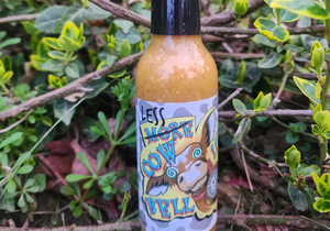
For example, Knoxious Beer Co. commits hard to the psychedelic sci-fi vibe. And it really works! From the neon colors to the trippy lettering and sunglasses-wearing Bigfoot, every detail on the label feels like a B-movie fever dream in the best way. It’s bold, weird, and completely unforgettable.

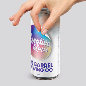
2. Make colors work harder
Instead of just slapping your logo colors on the label and calling it a day, you can use color to tell a story. Keep in mind that dark stouts don’t always need dark labels. Bright colors sell, but they also need context.
Use color contrast to your advantage. A neon green can with minimal type can stop someone dead in the craft beer aisle. Just make sure they can still read it.
How do I include legal info without ruining my design?
Use a small font size and keep it in a consistent spot. Beer label legal requirements are real, but they don’t have to kill the vibe.

3. Choose fonts that fit the beer (and the people)
Label typography isn’t the place to flex how many Google Fonts you know. It's better to stick with one or two typefaces that match the beer’s tone. Clean and crisp work well for a pilsner, while bold and rustic match the vibes of a barrel-aged monster.
🍌 Stomp Tip: Test font size and spacing with a real can in your hand. What looks good on a screen might not translate on aluminum.
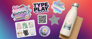
4. Add a moment of surprise
A hidden “weird beer fact” on every can, a joke in the barcode, or a QR code that leads to the playlist your brewer made while creating the batch. These are all little surprises that make the label part of the experience, and people love them!
Beer can labels that create a pause are the ones that get remembered (and Instagrammed). If someone picks up your can, stares at the art, reads the copy, and smiles before they even pop the tab? That’s brand loyalty in the making.

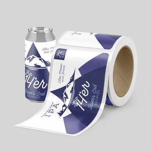
5. Order beer labels made from the right material
White BOPP or silver BOPP? Both are moisture-resistant materials that are great for cold storage and condensation-heavy settings, but the right choice depends on your design vision.
White BOPP is the go-to: clean, crisp, and ready to make your artwork pop like a citrus-forward IPA. Silver BOPP is where things get flashy (in the best way). It’s metallic, shiny, and catches the light like a disco ball in a beer cooler.
Want to get fancy? Print color directly over the silver with no white base and you'll have instant metallic hues in whatever shade you want. Add a white ink base first, and you’ve got solid, vibrant color that knocks out the shine where you need it. It’s a slick way to guide the eye and give your label a premium vibe, without blowing your whole packaging budget.
🍺 Order a Free Brewery Sample Pack!
Labels That Sell: What We’ve Seen Work in the Real World
Small batch runs = flexibility + fun
We've seen a West Coast brewery order different label designs for every batch of their rotating sour series. Same beer style, new can art every month.
They’ve built a collector mindset among customers, and some fans admit to buying every flavor—even the ones they’re not sure they’ll love—just to keep the collection going.
When the can is the merch
Forbidden Peak Brewery turned heads and scored over 42,000 likes on Instagram with a clever twist on traditional beer labels. They used our custom Drink ‘N Peel® Labels to show off beautiful Alaska Native artwork while giving customers a way to bring it home. Literally.
Each beer can came with a removable sticker designed by artist Abel Ryan, and the internet lost its mind. The result? A viral social post, a can that doubled as a keepsake, and customers who were as excited about the label as they were about the beer inside.
Moral of the story? Give people something to sip, stick, and remember.
Breweries building QR into the brand
We’ve seen brewers use QR code labels to lead to taproom playlists, brewmaster notes, or even interactive “name this beer” campaigns. A Stomp customer ran a label-to-web vote for naming their next release, and watched engagement spike across their social channels just from one sticker.
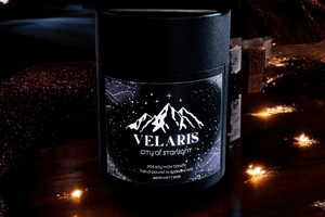
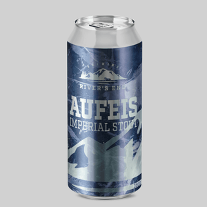
Limited releases shine (literally) with silver labels
One Midwest brewery wanted their seasonal stouts to feel a little extra, without going full glitter bomb. So they started using silver BOPP labels and designed them to let the metallic material peek through behind the beer name and key artwork.
The result? A label that screams “limited edition” before customers even read the style. The shine grabs attention while the design seals the deal. And the beer? Off the shelf faster than you can say “imperial barrel-aged.”
Give Your Beer a Label That Stands Out
If your brew is ready for the spotlight, make sure your label is ready to shine. Whether you’re running a small batch or keeping up with demand, our custom beer labels are built to look sharp, stick strong, and keep your cans in good company.
🎨 Create Your Custom Beer Labels On Stomp
Last updated: April 2026
- Lisa Brown