How to Design a Beer Can Label That Pops

Crafting the perfect beer can label is more than just sticking your logo onto some aluminum. It’s about weaving a tale, snagging attention, and showing off your brand’s swagger.
Whether you're a craft brewery pouring your heart into your latest brew or an established player rolling out a limited run, that label is your handshake, your first impression.
Let’s walk through how to design a beer can label that doesn’t just look good but resonates with your audience and makes them want to take a sip.
Must-Haves for a Killer Beer Can Label
Great beer can label design is a blend of art and strategy—it should sing your brand and spell out the must-know information. Here’s what you need to nail down:
Typography
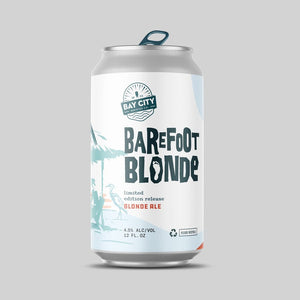
The right font can make or break your label. Going for old-school charm or sleek modernity? Make sure your typeface aligns with your vibe.
- Brand Name & Beer Name: Keep your brand name unmissable and your beer name snappy and complementary.
- Readability: Choose fonts that are easy on the eyes from afar. Skip the fancy script that’s all curls and no clarity.
- Pro Tip: Big, bold fonts are your friends when it comes to shouting from the shelves about what’s inside—IPA, stout, or lager.

Imagery and Illustrations
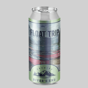
Set the scene with visuals that tell your brew’s backstory or just vibe with its flavor. Go minimalist or max out on art, but keep it true to what’s inside the can.
- Art or Photos: Hand-drawn doodles or clean-cut logos? Match the art to your brew’s personality.
- Mascots or Symbols: Got a recurring character or emblem? Weave it in to build familiarity across your lineup.
- Pro Tip: Balance is key. Let your art complement your info, not crowd it out.
Color Scheme
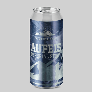
Color sets the mood on your can. Pick hues that suit your style and make your can stand out in a sea of sameness.
- Bold Colors for Bold Brews: Neon greens and fiery reds scream innovation and adventure.
- Earthy Tones for Classics: Subdued greens and rich browns speak to tradition and taste.
- Contrast is Critical: Make sure your text pops against the background for easy reading.
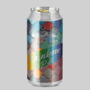
- Pro Tip: Remember, your can is round. Design for a wraparound view to make every angle a winner.

Logo Placement
Your logo is the flag of your brand ship—fly it with pride but keep it from swamping your message.
- Top or Centered: Prime real estate for logos because that’s where eyes land first.
- Integrate with the Design: Make your logo feel at home amidst your other design elements, not like a last-minute guest.
- Pro Tip: Keep it proportional. A logo too big overshadows the beer name; too small, and it’s a missed branding beat.
Legal Must-Dos for Beer Can Labels
Design’s fun until the law gets involved. Here’s the dry but necessary bit:
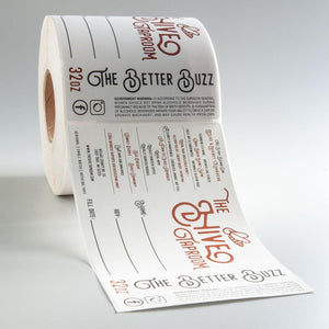
- ABV (Alcohol by Volume): Always state how tipsy your brew might make someone.
- Volume Statement: How much beer is in there? Tell it in ounces or liters.
- Government Warnings: Cover your bases with the required health advisories.
- Ingredients: Optional but often appreciated by the craft crowd looking for quality and transparency.
Always double-check your area’s label laws to keep your labels legal and above board.
Design Tips to Make Your Beer Labels the Toast of the Town
Here’s how to make sure your beer labels aren’t just seen—they’re remembered:
- Be Consistent: Use similar styles across your range for instant brand recognition.
- Storytelling: Every brew has a tale. Whether it’s the hops, the heritage, or the high times, share it on your can.
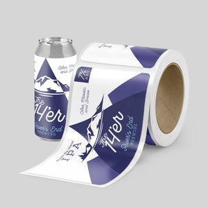
- Test It Out: Wrap a mockup label around a can to get a feel for the finished look. This helps you catch any wraparound weirdness before you go to print.

Wrapping Up Your Beer Label Design
Now that you know the ropes, it’s time to get those designs down and dressed on your cans. Whether you’ve DIY’d your labels or collaborated with a designer, we’re here to streamline the print process. Our design tool lets you upload, preview, and perfect your labels with ease. Fire up your creativity with beer labels from Stomp and let your cans do the talking!
FAQs About Designing Beer Can Labels
What makes a beer can label pop?
Bold fonts, striking imagery, and a smart color scheme that fits your brand like a glove. Keep it readable, relatable, and ready to resonate.
What’s mandatory on a beer can label?
Check your local laws, but generally, you need to display the ABV, volume, and a health warning. Ingredients and company info are often good form, too.
How can I make my beer can label legible?
Clear fonts, strong contrast, and avoiding clutter. Your beer deserves a label that’s as clean and crisp as the brew itself.
Where should my logo go on the beer can label?
Keep it prominent but balanced. Top or center works best, but make sure it plays nice with the rest of your label layout.
Can I create custom beer can labels online?
Absolutely! Use Stomp’s design tool to upload your design, tweak it to perfection, and get those labels ready to roll out.
- Tags: Brewery
- Nashira Edmiston


