Guide: How to Effectively Design a Restaurant Menu

Restaurant menus are an essential point of contact for anyone dining in your establishment. As soon as guests are seated, they are presented with the restaurant menu. It’s the first impression of the place and an opportunity to impress. If you don’t know how to design a menu, we’re going to dive into the science behind it — and yes, believe it or not, restaurant menu design is a science!
Your menu layout directs the guest’s attention in a very specific way. It progressively takes them through your offerings, from shared plates to appetizers to main courses, desserts, and everything in between.
Menu design can make or break your restaurant. An expertly designed menu is easy to navigate, nice to look at, and informative without being too complicated. At the same time, a poor layout can prevent people from ordering your most profitable dishes. In a worst-case scenario, poor menu design can actually encourage customers to order in a way that is stressful for your staff.
Given how much menu design can impact your business, modern menu design psychology is a must.
To help you design the ideal restaurant menu, we need to understand how to structure a menu, choose a layout, place items into categories, use colors, descriptions, graphics, and address pricing. We’ll also throw in a few tips to help you leverage your menu design to effortlessly upsell and cross-sell.
And if you’re not a graphic designer, don’t worry. Keep this guide as a handy checklist, and you’ll have a high-performing restaurant menu in no time.
How Do You Structure a Restaurant Menu?
Your menu structure will mainly depend on your restaurant style and the level of service. Can you group your menu items into categories? If so, this is an excellent place to start.
First, you want to think about your unique dining experience. Small plates and appetizers generally start the list, before moving on to heartier fare, entrees, and desserts. Want to make dessert a special occasion? Create a separate menu for your desserts and drinks. Each category should have its own section to help customers find what they’re looking for.
If you want to include specials or features on the menu, place them in a prominent area that will draw the customer’s eye. Just like reading a book or newspaper, people’s eyes are naturally drawn to specific places on a page. This science-backed approach is known as “the golden triangle,” as it has three points: the middle of the page, the top right, and the top left.
Most people look at a page in that order. If you place your most popular items there (or the things you would like to be the most popular), it could very well be the most profitable design decision you’ll ever make.
How Many Items Should be on a Restaurant Menu?
There are no rules as to how many items should be on your restaurant’s menu. If you’re just launching a new restaurant, there are bound to be tweaks here and there; your guests will ultimately let you know what their favorites are.
While every establishment is different, here are a few questions to consider before deciding how many items to put on your menu.
How Many People Do You Plan to Seat?
Larger restaurants can likely get away with more menu items. If you only have 30 seats, you don’t need 30 menu items. That will lead to food waste and shrink your margins very quickly. If you are a high-volume establishment and you expect to serve 250 people or more in one sitting, you will want to have more selections to provide diners with a variety of options.
What Style of Restaurant Are You?
Casual diners or family restaurants often have more menu choices because of the broad demographic they serve. On the other hand, fine dining establishments will narrow the choices and specialize. Pizza and pasta restaurants, for example, can get away with more choices as the food cost is relatively low, and people like to choose their toppings. Think about the kitchen first and what they can realistically produce with available personnel, capacity, and resources.
Do you offer multiple mealtime choices on one menu?
Does your restaurant offer breakfast, brunch, lunch, dinner, or late-night fare? If you’re open all day, are breakfast offers available at dinner time? Designing a restaurant menu can be tricky when you’re open all day — but it can be done. In this case, you may want to limit the choices under each section to make things easier on the kitchen. Many restaurants split their daytime and nighttime menus (think one side for breakfast and lunch and the other for dinner and late-night).
Will There Be Seasonal Changes, or Is Your Menu Written in Stone Year-Round?
This point is maybe less of a design issue and more about the verbiage of menu descriptions. You don’t want to lock yourself into ingredients you can’t get at certain times of the year. If you have seasonal offerings or expect to change the menu periodically, you’re better off creating a menu template that will allow you to edit and print on the fly.
How to Design a Restaurant Menu in 8 Steps
With the basics of structure and content in mind, how can we design a restaurant menu that is engaging, informational, and reflective of your brand?
In a way, menu design is pure psychology. A well-designed menu puts your guests at ease and instills trust. The opposite — a chaotic, misspelled, disorganized menu that’s hard to read — is unappetizing. People do judge a book by its cover. Your menu is your calling card. It should reflect your branding, personality, values, and the level of service you offer.
Are you ready to get down to business? Use these eight steps to design a restaurant menu that will leave a lasting impression.
1. Write Out Your Menu Items Before You Start Designing
List all your menu items, including descriptions of how it’s cooked, sauces, spices, finishings, accompaniments, etc. Descriptions sell your menu items. They don’t have to be too wordy, but they should inform. The better you do here, the fewer questions your servers will have to answer.
Use adjectives to make the dish sound even more exciting. For example, instead of saying “croutons,” you could say “cheesy sourdough croutons” or “fresh-picked local greens” instead of “a bed of lettuce.” Keep tweaking your descriptions until they make your tummy growl; that’s always a good gauge!
2. Create Food Categories
Separating your menu items into categories can mean different things for different restaurants. For instance, if you only serve breakfast, you might want to put your eggs benedict, breakfast sandwiches, omelets, and scrambles into their own categories.
For dinner-only establishments, separate your items into courses — shared plates, appetizers, and mains. Organizing your menus this way encourages guests to choose courses in a specific order. For example, a typical fine dining menu might list cold appetizers first, hot appetizers second, and entrees next.
When a restaurant presents guests with this menu design, they are more likely to order three courses before even considering dessert. You’ve instantly upped your check average!

Speaking of dessert, most restaurants use a separate menu for desserts and after-dinner indulgences. This approach tends to help with up-selling as guests may consider these items on their own merit instead of lumping them in with everything else. Additionally, the wait staff typically takes away menus after ordering, so a separate dessert menu can put your mouth-watering descriptions right in front of the customer’s eyes!
Casual, quick-serve, and family restaurants may want to include desserts and entrees on the same menu. In a faster-paced environment, it’s one less menu for servers to deal with. It also whets the guests’ appetite for what comes next.
3. Consider Eye-Scanning Patterns
When deciding how to design your restaurant menu's layout, consider people’s natural eye-scanning patterns.
Most people read a menu just as they would read a book — from left to right. That said, most folks will scan the menu first before diving deeper. To facilitate easy scanning, ensure you separate your categories with bold headings, ideally in a larger or more prominent font.
Remember the golden triangle: Middle, top right, and top left.
Those are the three spots your customers are most likely to focus on. Therefore, those should be the three spots with your best offerings.
4. Use Bold Colors
Colors work to draw the eye. They also help you separate menu categories, making them easier to navigate. Color also has a psychological effect on people, helping you elicit an emotional response.
Science says that red is the most “appetizing” color but don’t limit yourself. Think about your branding, clientele, and the type of cuisine you serve to inform your color choices.
Your menu categories, titles, and descriptions should be easy to read. Opt for simplicity with bold shades and a high-contrast design.
5. Grab Attention with Eye Magnets
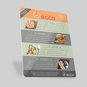
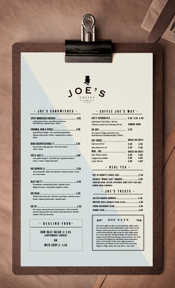
Eye magnets are just as you would imagine — menu design elements that stand out from the rest of the layout, so much so that your eye is immediately drawn there. An eye magnet can be anything from a featured dish to a box with happy hour pricing, a photograph of a dish, or a fun illustration. Eye magnets break up the layout and add dimension. Use it to capture attention, inform, or make a bold statement.
The menu below has a couple of strong eye magnets; they are the first things you notice, and we’ll bet they sell a lot of that kale salad.
6. Use Graphics or Images
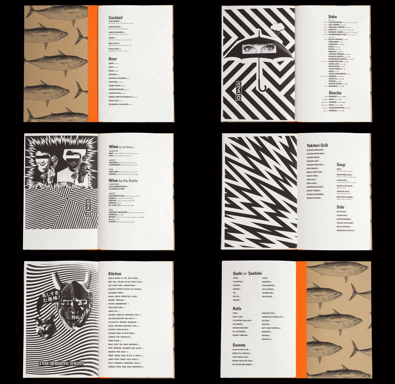
Graphics and images may or may not be appropriate for your restaurant menu design, but when done right, they can get people excited and compel them to order. If you decide to add images to your menu, ensure they are high-quality, professionally-shot photographs of your actual menu items. Never use stock photos. Stock photos may look great, but if they don’t align with what you’re actually serving, you will lose customers.
Graphics or illustrations are another way to add interest and jazz up your menu to align with your branding. The menu below is fun to browse and makes you want to dig in. While it’s several pages, it’s categorized well and gives the diner everything they need in one neat, uber-cool package.
7. Strategize Pricing
Restaurant menu pricing is critical to your profitability, but you can’t charge more than the market will bear. It’s not unusual for restaurants to have loss leaders – popular menu items that don’t make them any money often paired with other offers that have a significant margin.
An example might be beer and chicken wings. You might not turn a huge profit on the wings, but spicy food will cause you to sell more drinks at a premium. It balances out in the end.
To ensure you don’t have too many loss leader items, get your recipes and spreadsheets out, figure out your costs (food costs, labor, fixed/prime costs), and assign a reasonable markup that covers you and makes the customers happy. It has to work both ways, or you’ll be in the red pretty fast.
8. Upsell/Cross-Sell
Cross-selling and upselling are excellent ways to increase revenue and delight your customers. The right restaurant menu design helps you do this effortlessly, i.e., without putting undue pressure on your staff. If you’re like most other restaurants at the moment, you’re probably short-staffed, so why not let your menu do the talking?
In the menu below, the restaurant pairs each item with a suggested wine, reducing the burden of choice for the customer, and optimizing the server’s time. Add by the glass and by the bottle pricing for suggested wines, beer, or other libations, and watch your check average soar!

How Stomp Can Help Print Your Restaurant Menu
When you’ve written your descriptions, priced your menu items, and designed your restaurant menu, it’s time to print. Stomp’s design tool allows you to upload your completed design directly to our website, and we’ll take care of the rest.
If you’re not sure how to design a menu, specialized design tools like Canva can provide you with a professional template that gives you a place to start. From there, you can use the design tips we’ve shared here to personalize your restaurant menu and make a design that will leave a mouth-watering first impression.
Hungry for good design? Order your Custom Restaurant Menus here.
- Tags: Design Guides Restaurants
- Marketing Team


