Bottle Labeling Tips and Tricks

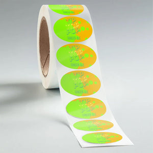
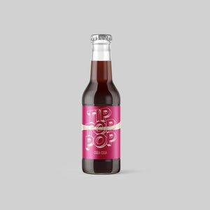
They say not to judge a book by its cover, but when it comes to bottles, the story begins with the label. Whether you’re brewing up craft beer or concocting luxurious hand lotions, designing and applying the right bottle label is a critical step when establishing a connection with potential customers.
However, crafting the perfect label requires attention to detail, especially when it comes to ensuring the label fits seamlessly on your chosen bottle. Learn our top tips and tricks to amp up your bottle labeling game.
Bottle Before Label
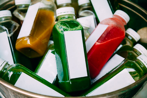
It's important to consider the bottle itself before diving into the creative process of designing a label. Choosing a bottle without knowing its dimensions can lead to a costly mistake — imagine ordering a batch of 1000 labels, only to find they don't fit! A disaster, right?
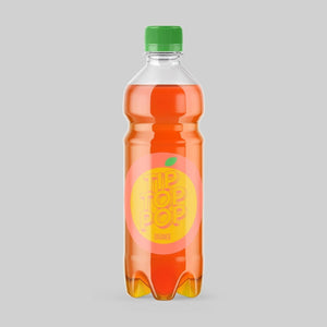
For a perfect fit and a professional look, you need to play matchmaker with your bottles and labels. For example, wraparound labels work best for round bottles with straight, non-tapered sides. But they’re not suitable for bottles with textured surfaces, such as a hexagonal honey bottle. For bottles with flat sides, use separate front and back labels. Understanding the bottle's shape is fundamental to creating a memorable product.
Readability is Key
When designing your bottle labels, put readability first. A visually appealing label is only useful if customers can read the information it conveys. Ensure that your font choice is legible and in a contrasting color that stands out against the label background.
A font is readable when it ensures adequate contrast with surrounding elements, considers spacing based on bottle shape, and uses distinct characters to prevent confusion. Additionally, opting for dyslexic-friendly fonts (e.g., sans serif options such as Arial, Verdana, and Calibri) enhances accessibility in smaller print for ingredients, descriptions, and disclosures.
Some of the best fonts for labels include:
- Georgia
- Garamond
- Open Sans
- Helvetica
- Arial

White Space Matters
White space is critical for impactful design. Too much clutter and you might overwhelm consumers and dilute your message. Embrace the concept of "just enough" graphics and text, leaving sufficient space between elements.
Remember, a strong tagline and compelling logo can speak volumes without the need to crowd your label. By striking the right balance, your label will achieve a clean and sophisticated look that captivates your audience.
Tips for Bottle Labeling by Hand
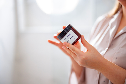
Whether you're selling smoothies or honey, you need your bottle labels to attach smoothly and securely. If you’re small-scale and applying labels by hand, picking up a few techniques will help you get seamless, professional-looking results.
Find the Seam
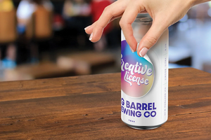
When applying labels by hand, precision is critical. Locate the bottle's seam and align the label to ensure a proper fit and a straight application. This small but crucial step can prevent misalignments and contribute to a polished finish.
Pull it Taut
To achieve a smooth application without bubbles or wrinkles, pull the label taut while affixing it to the bottle. This creates a flawless appearance and enhances the overall quality of your product presentation.
Use a Jig
Depending on the scale of your operation, consider investing in a simple jig (a horizontal bottle holder) to streamline the manual labeling process. A jig provides stability and alignment, resulting in the cleanest possible application without the need for machine assistance.
Take Your Bottle Labeling to the Next Level with Stomp
From craft beers to artisanal kombuchas, every bottled good needs a label. Crafting the perfect bottle label involves understanding bottle dimensions, emphasizing readability, and appreciating the importance of white space. So, whether you're applying labels by hand or using machinery, attention to detail is key.
Ready to uncork the potential of your products and elevate your bottle labeling game? Check out our bottle labels and discover how they help you stick the landing.
- Nashira Edmiston

