What’s the Right Shape For Your Custom Beer Labels?

You’re not a procrastinator. Your custom beer bottles need custom beer labels right now—which is why you ordered 500 oval paper roll labels, post haste.
But something’s off. After applying them to your beer bottles, you notice the label looks like an ill-fitting shirt. There’s too much bottle showing. The custom beer labels have your beer bottles looking more like beer bellies.
We all learn our shapes before kindergarten. Yet as adults, we’re so out of practice with shapes, we don’t consider their impact. To eliminate the “beer belly” problem with shapes that are two horizontal, as well as a host of other problems, let’s examine which custom beer bottle labels have the best shapes for your products:
Your Options: The Shapes of Custom Beer Bottle Labels
Wrap Around
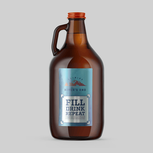
A big, bold rectangle, the wrap around is ideal for lots of text — giving your customers something to read. Unless you want people to see inside, the wrap around shape is ideal for writing a veritable Russian novel packed with information about your flavor and your brand.
Rectangular

Maybe you don’t want a ton of information. A rectangular shape, similar to a wrap around, occupies lots of vertical space on the bottle. This gives plenty of coverage and helps avoid showing too much bottle — a look some people associate with cheapness.
[Shop Our 12 oz Rectangle Beer Bottle Labels]
Circular

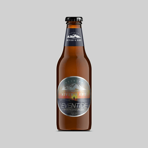
Maybe you want your bottles to show a little “skin” — or in this case, glass or plastic. Circular labels might not cover the entire bottom of your beer bottle, but they offer a minimalist aesthetic that some people love. These labels are especially great if there’s something unique about the bottle itself and you don’t want a label to get in the way.
Another thing to note: see how in the picture above, there’s a prominent bottleneck label in place? A smaller, circular label on the bottom can help balance it out. Otherwise, your bottle may run the risk of looking “underdressed.”
[Shop Our 12oz Circular Beer Bottle Label]
Oval

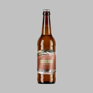
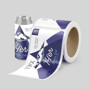
Let’s talk aesthetics for a moment. If you have a fun, highly visual label — the Cascade Triple IPA above shows mountains, for example — then a straight edge on the label might seem like a letdown by comparison.
In that case, have a little fun with your label shape. A horizontal oval, as you see here, helps highlight what’s on the label’s background.
[Shop Our 12oz Oval Beer Bottle Label]
Die Cut
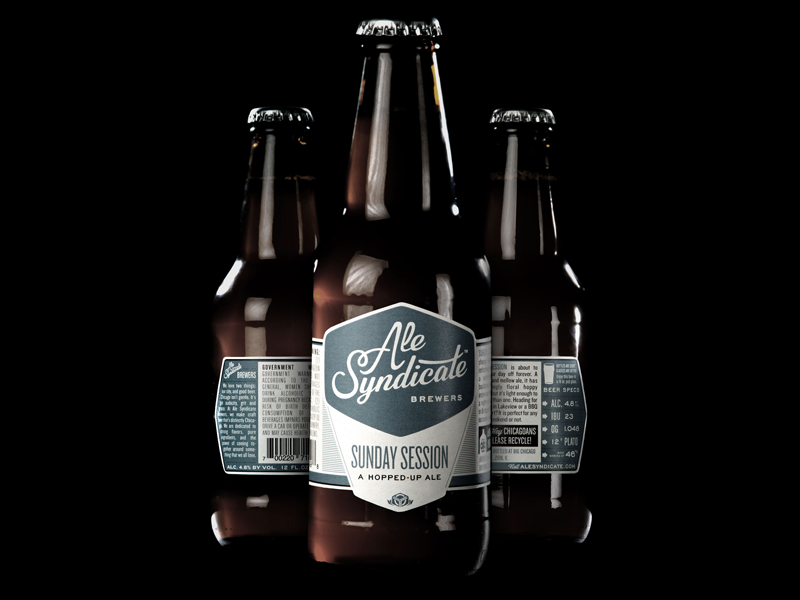
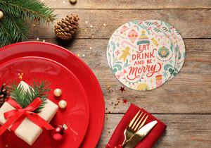
Maybe you don’t want a straight edge at all, because your brand isn’t “straight edge.” And so, what if it isn’t? Enter the die cut, a custom-cut label shape. Pineapples, jungle gyms, mountains — if it has a shape, it all works. If you want the label to reflect the fun and festive theme of your brand, there’s no reason you can’t cut the label to match your design.
[Shop Our Custom Die Cut Stickers]
Bottleneck Stickers

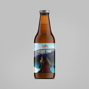
There’s something … well, “topless” about a beer bottle without a bottle neck label, isn’t there? Done right, as you can see above, the bottleneck sticker creates a smooth, professional finish to the bottle. Even better, it can complement and highlight the label on the bottom to give your brand a clean look.
Label Shape Inspiration: Learn from the Masters
Browsing the above might have been enough to give you an idea or two. But it never hurts to learn a bit more about creating your custom beer labels, especially from brands who have already done it.
Use Contrast to Choose Your Label

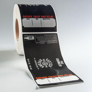
Red and black. Big, bold font. Straight angles. All of it might look a little bit harsh if the brewery used straight-edged, rectangle beer bottle labels. But note the subtle oval shape of the bottom label — a smooth contrast that doesn’t go overboard. Instead, the shape highlights the tight, packaged look.
Match the Shape to Your Brand Aspiration

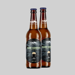
Above, the large circle shape of the label meets the lines on the beer bottle glass. Notice the effect? It’s as if this whole package isn’t a beer bottle at all—it’s a heavy drinking glass, as pictured. Slow Currents Coffee Stout combines image and shape to show you that this isn’t an ordinary beer bottle experience. It’s something to savor.
Use Die Cut Shapes to Highlight Your Logo

Though these appear to be wrap arounds, do you notice something? The “shark” logo here is die cut right into the shape of the label. This highlights the shark, making it appear to pop in almost three dimensions.
Why Shape Matters: Make an Impression that Sticks!
At first glance, the shape of your custom beer labels seems like a quick decision. Square or circle? It doesn’t really matter, does it?
But in beer labels, it’s all about aesthetics. You can let your shape reflect your messaging—as Slow Currents Coffee Stout does or you can go “die cut,” highlighting your logo, like Dogfish Head Brewery.
Whatever you do, don’t make the choice lightly. Take some time to decide on a unique label that will help your brand pop.
To accomplish that, you’ll need to be unique. Another word for unique? “Custom.” Stomp Stickers offers a variety of custom brewery labels to craft superior packaging that makes an impression and — dare we say it? — sticks.
- Marketing Team

