Define Your Brand: Choosing a Small Business Color Palette

In the world of business, first impressions matter, and nothing makes an impression quite like a bright pop of color. A unified color scheme or palette can harmonize signage, packaging, and other elements, creating a cohesive and distinct brand identity. Think of some major brands, and you’ll notice that each has a well-defined business color palette that appears in all of their physical materials and marketing.
But how do you choose a color scheme that complements your brand and makes customers feel in tune with your business? To find out, let’s explore the pivotal role of a well-defined color palette in establishing a small business brand.

What Is a Business Color Palette?
A business color palette is a carefully curated selection of colors that represent a brand consistently across various platforms. It's not just about aesthetics; it's a strategic choice that influences consumer perceptions and behaviors. For example, red gives consumers a sense of passion and energy, while blue provides a feeling of calm and tranquility. The psychology behind color theory can provide valuable insights into consumer decision-making, detailing the associations and emotions tied to different hues. Applying those insights to your brand helps you make a splash with your target customers.
Why Does Business Branding Matter?
A consistent and cohesive brand identity boosts your brand recognition, making it easier for customers to remember and seek out your products or services. That makes for more impactful marketing and increased sales.
More generally, your business branding plays a pivotal role in influencing consumer perceptions and preferences. For example, if you emblazon your products with whimsical imagery and bright colors, your customers may associate your brand with playfulness, creativity, and childhood. By contrast, sleek, monochromatic branding gives your business a more sober and serious vibe.

Practical Tips for Choosing Brand Colors
As you embark on the journey of choosing brand colors, it's essential to understand the profound impact colors can have on consumer behavior. Read on to learn more about steps you should take to make informed decisions about your brand’s visual identity:
Consider Your Target Audience
Understanding your target audience is fundamental to selecting the right colors. Recognizing their needs and preferences allows you to tailor your visual identity effectively. For instance, if your target demographic seeks excitement and boldness, incorporating shades of red may be impactful. Likewise, red is a color that makes people hungry, which is why it is so prominent in restaurant color schemes.
On the other hand, if trustworthiness and calmness align with your audience's preferences, selecting a palette dominated by blue tones could be more suitable. By aligning your brand colors with the emotions you aim to evoke in your audience, you create a visual identity that speaks directly to their needs and cultivates a stronger connection with your brand.
Learn About Color Psychology
Color psychology is a guiding principle in the art of choosing brand colors. The emotions associated with each color can shape consumer behavior. Consider the associations of key colors: red for excitement, yellow for optimism, green for nature, and so on. Your color choices should resonate with your brand's personality and values.
Look at Competitors
You want your brand to stand out, and that means looking different from your competitors. Before you establish your own color palette, analyze your competitors' color choices so you can be sure to differentiate your brand. It’s worth the time to carve out a unique visual identity. For example, consider how Lyft differentiated itself from Uber’s black and white with a bright pink aesthetic.
Accessibility and Color Contrast
Beyond aesthetics, consider the practical aspects of color usage. Ensure your color choices provide sufficient contrast, especially in digital contexts like your website or social media page. High contrast enhances readability and accessibility, contributing to a positive user experience for all your customers.
When selecting a business color palette, remember to consider readability. A pink logo on a bright yellow background might work in certain shades of those colors but not others. Try adjusting the colors until they are legible at various distances and appealing to the eye.
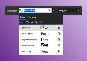
Choosing Web-Friendly Colors
In the digital age, prioritizing web-friendly colors is essential, and achieving consistency across different devices hinges on understanding RGB and HEX codes. RGB, representing red, green, and blue, is the standard electronic display color model.
Meanwhile, HEX codes offer a concise and standardized format for specifying colors in web design, with each six-character code encapsulating the intensity of red, green, and blue. Mastery of these codes empowers web designers to maintain precise control over color schemes, guaranteeing accurate and cohesive visual presentations across multiple browsers and platforms.
Testing for Print and Digital Consistency
Colors may manifest differently in print and digital formats. Rigorous testing is imperative to ensure uniformity across diverse mediums. When exploring various business color palettes, try printing them out on paper and viewing them on a screen. Experimenting with different types of paper or alternative surfaces, such as fabric, can improve your understanding of how your chosen color palette will appear across various mediums.

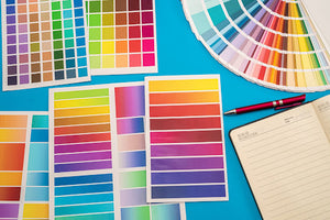
Creating Your Small Business Color Palette
Crafting a compelling visual identity for your small business begins with the meticulous selection of a color palette. You need brand colors that not only appeal to the eye but also resonate with your brand's values and personality. And most important of all, they’ve got to look good together! In this section, we explore the intricate process of creating a color palette for your small business:
Choose Colors That Align with Your Brand's Values
What does your brand value? If you aren’t sure, start by developing a list of keywords that describe your brand, like “stylish,” “modern,” “fun,” “quirky,” or “innovative.” Then, choose colors that align with those descriptors. This process aids in selecting colors that align with your brand identity and creating the desired effect on your audience.
Select the Primary Brand Color
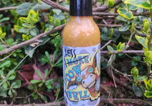
The primary brand color serves as the cornerstone of your palette. It should encapsulate the brand's main personality traits and appeal to the target audience, representing the brand's identity effectively. For example, if your brand embodies the outdoors, a pine tree green could serve as an effective primary color.
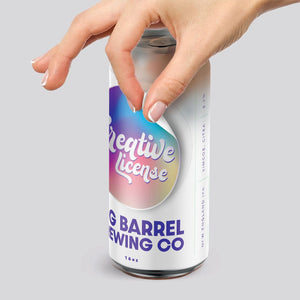
Complement with Secondary and Accent Colors
A comprehensive palette includes secondary and accent colors that enhance the primary hue. Accent colors contribute to visual appeal and convey additional brand attributes, creating a well-rounded and visually engaging palette. Make sure the different colors of your palette contrast with each other and don’t just come from one part of the color wheel. For example, if your primary color is dark or neutral, adding a bright, saturated accent color can help you make your visual branding pop.
Testing and Refining Your Palette
Thorough testing and refinement are essential steps in the color selection process. Testing can manifest in several ways. On a small scale, this could look like showing potential color schemes to customers and gauging their reactions. It could also mean doing a small test run of labels with your updated branding and seeing how it affects sales. Comprehensive testing ensures that the palette resonates with your audience and maintains consistency across diverse touchpoints.

Pick The Perfect Brand Color Palette with Stomp
As you begin defining your brand through color, Stomp Stickers stands as your trusted partner. Our custom stickers and labels offer a canvas for your chosen colors, enabling you to make a lasting impression. Ready to infuse your brand with vibrant hues? Explore our range of small business products and start leaving your mark today.
- Tags: Design Small Business
- Nashira Edmiston