How to Design a Cider Label That Sells


First impressions don’t happen on the first sip—they happen on the shelf. Before someone ever pops the cap, your cider label is doing the talking. It’s telling them who you are, what kind of cider you make, and whether your blend belongs in their hand—or back on the shelf. Let’s walk through how to design cider labels that don’t just look good… they move product.

Start with What You’re Actually Selling
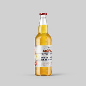
Yes, it’s cider. But is it bone-dry and tart? Sweet and cozy? Spiced for fall? If you want your label to sell, it has to match the vibe of what’s inside.
- A clean, minimal design might scream “crisp and dry.”
- A hand-drawn orchard illustration might say “fresh and small-batch.”
- Metallic fonts and dark glass? That’s leaning towards premium.
Design tip: If your label feels like your cider tastes, you’re already ahead of most brands.
Tell a Visual Story (in Three Seconds or Less)
Your cider label needs to work fast—people are scanning shelves, not studying museum walls. Use visual storytelling that says something clear at a glance:
- Typography: Big, clean fonts tell shoppers you’re confident. Don’t cram in five typefaces—just pick two and give them room to breathe.
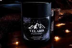
- Color: Earth tones feel rustic. Brights say playful. Metallics lean luxury. Match your color palette to your positioning.
- Imagery: Think beyond apples. Maybe it’s the region, the season, or the mood you want to evoke.
If your label was a billboard for your cider, could it get the message across in one glance? That’s your design gut check.

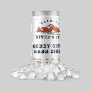
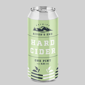
Nail the Label Size + Placement
No two bottles—or cans—are alike. Your label size and shape should fit the vessel without forcing it.
Bonus tip: Always prototype your label before print. Even the slickest design can fall flat if it curves wrong on the bottle.
Be Compliant, Without Being Boring
Alcohol labeling has rules—no one wants a fine over font size. But compliance doesn’t mean your label has to look like a spreadsheet.
Here’s the non-negotiables:
- Alcohol by volume (ABV)
- Government warning
- Producer info
- Volume (in ounces/ml)
How to keep it pretty? Tuck that info into the back label or in small type at the bottom. Don’t let the legal stuff run the show.
Make Your Cider Labels Pop Off the Shelf
If you’re on a shelf next to 12 other ciders (or worse, a sea of beer labels), your label needs to pull focus.
- Die-cut labels stand out, especially with curves or unusual shapes.
- Matte finishes feel more tactile, especially for rustic blends.
- Gloss + foil accents help when you want a luxe look.
Custom labeled products like cider often succeed not just on flavor—but because the packaging makes someone pick them up in the first place.

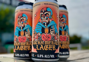
Yes, This Applies to Beer Too
Cider and beer might live in different aisles, but their packaging game plays by the same rules. If you're working on your next custom beer label or need a fresh take for your beer bottle labels, the tips here still hold up: lead with story, design with clarity, and always label like someone’s making a decision with their eyes first.
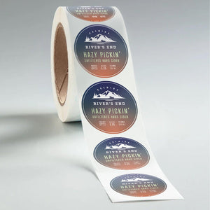
Don't Forget Roll Labels for Big Runs
Printing your cider labels on roll labels gives you:
- Lower cost at volume
- Compatibility with auto labelers
- Less waste and faster turnarounds
They're perfect for cans or bottles going through higher-speed production—or for brands scaling up beyond hand-stickering every six-pack.

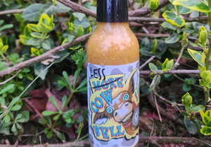
Cider Labels That Totally Nailed It
Some labels don’t just sit on a shelf—they move off it. Whether it’s the typography, the tone, or the fact that someone clearly knew what their audience wanted, these brands made label choices that hit the mark:
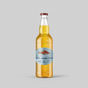
- One orchard-backed cider brand used minimalist white labels with just their hand-lettered logo and ABV—nothing else. It stood out because it whispered while everyone else shouted.
- Another went full seasonal: apple cider with an autumn-toned wraparound, limited-run roll label that read “tastes like falling leaves and flannel”. It became their best-selling batch.
The common thread? Each cider label reflected the product—and the personality—behind it.
Make Your Next Label as Fresh as the Cider Inside
Whether you’re bottling your flagship apple cider, test-driving a seasonal blend, or brainstorming your next round of brew, our custom cider labels are built to look sharp, hold strong, and say the right thing—before the first sip.
From shelf appeal to stickability, we’ve got what you need to make sure your cider shows up and stands out.
FAQs
What label size fits a standard cider bottle?
Most 12–16 oz bottles use 3" x 4" or 4" x 5" labels. Measure your bottle’s flat area to be sure—neck curves can mess with fit. Check out our label size guide for some extra guidance.
Can I use the same label for bottles and cans?
Technically yes, but sizing and surface might vary. Use roll labels and size-smart templates for multi-use designs.
Are cider labels waterproof?
They should be! Use waterproof BOPP if your cider will be chilled or handled a lot. No one likes a soggy label.
What’s the best label finish for cider?
Matte feels earthy and handcrafted. Gloss makes color pop. Foil adds a premium edge. Match finish to your brand’s tone.
Do I need to list ingredients on my cider label?
Usually not—but ABV, volume, and government warnings are required in most states. Check your local regulations.
- Nashira Edmiston