Design Inspiration: 10 Dope Cannabis Logos That Are Totally Lit

It’s no secret that cannabis is a growing business — literally! Weed sales are expected to exceed $61 billion by 2026, making it easy to see why everyone from Snoop and Tommy Chong to Gwyneth Paltrow and Martha Stewart stuck their green thumbs in the market. With so many brands crowding the grow room, what makes a cannabis business logo stand above the rest?
Keep in mind, when it comes to cannabis, what may float one person’s boat might be a buzzkill for another. But once you understand your target audience, a good logo can cut through the clutter — and help your product fly off the shelves.
Need a little inspiration? Consider this your higher education in cannabis branding — because these ten cannabis logos are totally lit.
1. Stash Premium Cannabis

Pardon us, is there anything more refined than a well-groomed mustache? Stash Premium Cannabis doesn’t think so. The gradient gold mustache iconography (get the stash pun?) and subtle serif font blend for the perfect hybrid of lighthearted luxury.
Cannabis logos like this one let the customer know what to expect: an artisanal, quality product that doesn’t take itself too seriously — which may be exactly the kind of experience they’re looking for!
2. Green Genie Dispensary

Green Genie’s tagline is “granting your wishes, daily,” but they don’t need to say it — their logo does all the work. If the vibrant green color, hemp-leaf hair, and the fact that most media images depict genies manifesting from smoke don’t tip you off, the smile and friendly finger gun should.
Cartoonish and counterculture, weed logos like this one have high appeal to recreational users of all backgrounds. And since the hallmark of genies everywhere is service, this cannabis business logo makes it super clear that your wish is their command.
3. Curaleaf
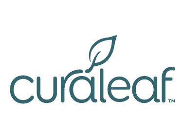
Minimalistic, clinical, and accessible, Curaleaf Dispensary's logo doesn’t go over the top making it a simple, trustworthy choice for new medical marijuana patients, as well as those with preconceived ideas about smoking pot in general.
With a focus on clarity, Curaleaf’s logo reads more like a wellness brand — which makes it feel a lot less intimidating for new customers.
4. Island Cannabis Company

Buying cannabis has gotten more complex but Island wants to take you back to simpler times. You don’t have to be an expert just to kick back and relax with Island products and their logo is proof positive.
With a leaf-inspired palm tree and major So-Cal vibes, Island tells you exactly who they are — a laid-back brand that wants to bring you to the sunnier side of life.
5. Dreamt

Don’t you already feel more chill just looking at this logo? Dreamt’s primary products are cannabis sleep aids and this design cuts right to the chase. With a low-key, lowercase font and a modern half-moon graphic, it appeals to newbies and experienced users alike.
Simple, elegant cannabis logos like this one help ease any stigma associated with THC use and instead focus on the core benefit — in this case, a great night's sleep.
6. Fun Uncle
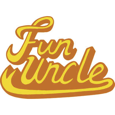
Lots of cannabis logos aim for a retro vibe, but few do it like this one. Fun Uncle’s hand-drawn quality has a carefree swagger that recalls the smoke-filled heyday of the 1970s.
We think this logo would appeal especially to craft beer drinkers, festivalgoers, and old-school stoners, but of course, to anyone who’s looking for a budget-friendly, easy-going good time. Well, alright, alright, alright…
7. Wana Wellness

Who wants to live their best life? If you’re raising your hand, Wana Wellness is speaking to you — and they’ve got a logo to match. The 5-pointed graphic works on three levels: as an homage to the cannabis leaf, as a symbol of balance, and, with the addition of the horizon line, as a message of optimism.
Wana makes the experience self-care, so their customers can live life to its fullest. With clean lines and a calm color palette, Wana is speaking directly to yogis, clean eaters, self-helpers, and anyone else looking to jump on the health and wellness train.
8 Monogram

Ultra-premium in design and product, Monogram’s ethos is “the good life, redefined.” And would you expect anything less from owner/mogul Jay-Z?
Clean, structured, and architectural, Monogram reads more like a high-end cologne or fashion brand — which is a good thing, because that’s exactly the audience it’s trying to reach. With its monochromatic colors and lack of traditional THC tropes, Monogram proves that even weed logos can go upscale.
9. Kushy Punch

This logo is equal parts sweet and sass, with a hefty handful of 80s-era candy, toys, and manga — but these tricks definitely aren’t for kids!
With its bright, playful colors, Kushy Punch is both unique and recognizable, making their line of gummies an easy grab for customers looking to “feel the power of the punch.”
10. Dime Bag

Throwback alert! For many customers, this cannabis business logo brings them right back to where their weed journey began.
Dime Bag pays tribute to old-school slang with budget-friendly products for folks who just want to smoke and have fun. A Sharpie-like font over a masking tape graphic hits a street-smart note appealing to skaters, concertgoers, simple smokers — and anyone else looking to relive the 90s.
Ready to Roll?
While cannabis might be a single industry, today’s customers come from all walks of life. From true weed aficionados to those experimenting for health and wellness purposes — and everyone in between — there’s definitely an audience or three your brand can (and will!) appeal to.
Luckily, creating dope labels doesn’t have to be a high-maintenance project. If your cannabis business logo is ready to roll, let Stomp give you an assist! We’ve got simple, easy-to-use tools to make high-impact, custom-printed products, like labels, stickers, magnets, and other packaging that will “leaf” the competition behind.
Need a little help growing your budding business? THC what we mean and start designing your cannabis labels today!
- Marketing Team


