Design Inspiration: 12 Craft Soda Labels That Really Pop

Your craft soda may be popping with deliciousness, but it also needs a buzzy label. Why? Because 85% of consumers decide to buy based on the label alone. And on average, they do this in seven seconds flat.
An eye-catching, branded soda label is critical for moving more product and generating recurring revenue for your brand. Easier said than done. An excellent soda label entices, dazzles, and wows. It must:
- Instantly communicate the product’s value
- Connect with the right buyer
- Provide pertinent information
- Demonstrate your brand’s quality standards
Good news! With the right tools and some inspiration, you can create a label that captures the customer’s attention and helps your brand stand out. To get you started, we found twelve labels that are soda-lightful.
#1. Jarritos: Colorful — But Not in a Weird Way
Jarritos, hailing from Mexico and made with real sugar, has become increasingly popular in the US.

It’s not hard to see why. The product lineup offers a range of yummy drinks that are sweet but not sickening. Outfitted in a clear label with graphics that pop against each soda color, the glass bottles are a little bit retro and a little bit mariachi band bold.
As you can see, the label is super colorful but not in a chemically laden, cyberpunk dystopia kind of way. So, if you’re thinking that a colorful soda label speaks to your brand and your target customers, use Jarritos to spark your inspiration.
#2. Bubble Up: Mid-Century Meets Modern Design
Simple and screaming mid-century Americana, Bubble Up recently celebrated its 100th birthday. Hailing from Sandusky, Ohio, Bubble Up was the precursor to the more widely known 7Up.
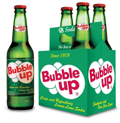
What we like about the Bubble Up label is the simple retro design. The label blends perfectly with the green glass bottle and the big bold red font lets the brand name stand out.
Mostly, we like how the label effectively communicates what’s inside — a kiss of lemon, a kiss of lime. Creative!
#3. Johnnie Ryan: When You Want Your Soda Bottle to Whisper, Elegant.
A legacy brand, Johnnie Ryan soda offers tasty classics like ginger ale, root beer, cherry soda, and cream soda. The logos are elegant and so is the font.

Topping off its pinky-out fanciness, a classic coat of arms bedecks the top of the graphic, with the soda bottle labels written in all French. Tres magnifique!
If you're positioning your craft soda brand for the ritzy Gary Cooper crowd, take a page out of Johnnie Ryan’s book.
#4. Pioneer Vintage Grape Soda: Hand-Drawn Handsomeness
Beautiful, hand-drawn labels in contrasting colors stand out from all the noise on the shelves.

If you’ve got the eye of Durer, show off your creative skills and design your very own hand-drawn soda label. If not, then commission a design and support an independent artist.
Gussying up your bottle with a hand-drawn design is an excellent choice if your craft soda brand is a pioneer of artisanal flair.
#5. Santa’s Soda Shoppe: Titillating Typography
Sure, you can stand out with a logo. But did you know that you can also stand out with the font?

This custom-designed soda can label takes titillating typography up a notch, with vintage cursive lettering, contrasting colors, and attention to detail.
If logos and imagery aren’t your things, why not give your craft soda label a competitive edge with unique typography?
#6. Q: Keeping it Simple
Simplicity is the mark of genius.

Q soda has an elegant font denoting the flavor, along with a simple swirling logo and a few accents on the sides of the bottle. For each flavor, a different splash of color flecks the typography.
With so many craft sodas to choose from, many business owners fall in love with a complex label and busier design. In this case, less is more.
#7. Rapscallion Soda: Bright, Bold, and Funny
On its face, Rapscallion soda can labels appear rather minimalist with their naked aluminum cans. But the bright, cheerful label and the glint of the shiny can pulls the eye in.

Take a closer look and you’ll read creative flavor names and humorous descriptors. It’s tough to resist Ginja Ninja, Fiery Throat Kick!
#8. Thy Lemon: Refreshing Serenity
Lemon and lime flavored, bubbly sodas are the perfect nightcaps after a long summer day.

Thy Lemon soda bottle labels do an excellent job of conveying the tasty, refreshing serenity of the crisp lemon libation inside.
#9. Humble Honey: Like Bees to a Flower
The Humble Honey Soda bottle looks like a bumblebee sitting on a shelf. Bold, contrasting butterscotch and black stripes wrapped around the cinnamon-shaded glass bottle buzz with the promise of sweet nectar inside.

Take a page out of Humble Honey’s book if you want to go bold and colorful. The design does an electrifying job of drawing you in to take a closer look at what's in the bottle!
#10. Emma & Tom’s: Let Your Soda Pop
Is your soda an enticing color? Then show it off with a transparent bottle and label.

For Emma & Tom’s Sparkling, the drink itself is a significant selling point. The typography is a sleek white, the logo is small and straightforward, and the drink colors contrast beautifully with each flavor icon.
#11. London Essence: Elegance on Display
One of the biggest challenges for craft soda makers is standing out against the big brands. What makes your product better? It sits in a class of its own.

London Essence soda sits in unique bottles with a label that screams elegance. The colors match the product inside and you have a good sense of the brand immediately. No one will confuse these with another brand.
#12. Fizzilla: Anthropomorphize to Increase Shelf Appeal
Have you ever felt like someone was staring at you? Did you immediately look in the direction of the person staring at you? Why not capitalize on this same phenomenon with your soda bottle label?
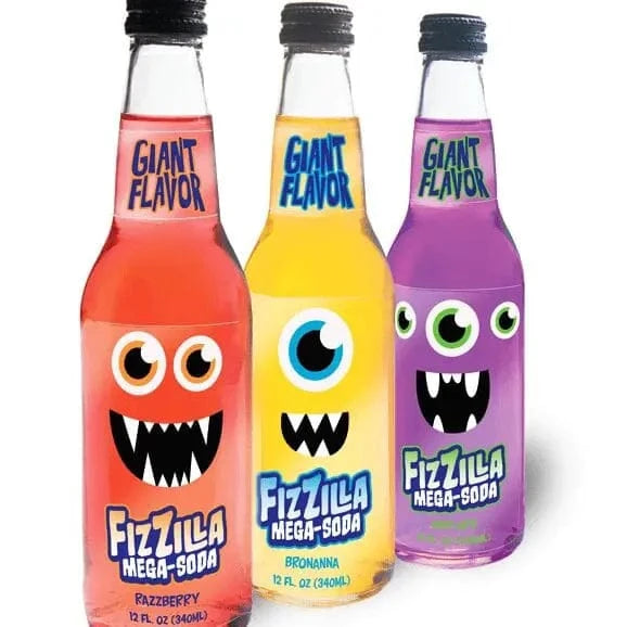
Fizzilla makes their labels fun, and they certainly appeal to kids. Their googly eyes stare at you from the shelves, catching your eye and perhaps your wallet.
Inspired yet? Start Designing with Stomp.
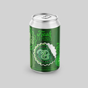
If these enticing craft soda label designs have inspired you, we can’t wait to see what you come up with. Our proprietary design tool will help you easily create the soda can label of your dreams and we also offer expert advice if you need a few pointers. Let the good times and the soda can labels roll!
- Nashira Edmiston


